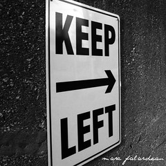
photo by Marc Falardeau
I miss the old Crossfire show on CNN. Remember? The announcer began the show with, “Crossfire…from the left, Michael Kinsley, and from the right, Pat Buchanan.” Now I almost always (OK, always) agreed with Michael Kinsley, but Pat Buchanan was entertaining with his off-beat views and terrific sense of humor.
And it’s the same with your Web pages. Yes, I’m a diehard democrat and I admit the Crossfire metaphor is tenuous, and I am poking a little fun at my Republican friends and family (hi Mom!). But when it comes to your website design, speaking from the left is the smart approach and from the right…well, not so much.
A Conventional Website Layout Means a Profitable Website
You know that businesses are constantly thinking of ways to be different. In fact, one of the primary functions of an effective homepage is your Unique Value Proposition (UVP). My clients and I spend considerable time discovering the thing that makes them different from the competition.
But in our enthusiasm to stand out from the crowd, we sometimes get carried away. And one of the places that we should never be different is in the way your visitors scan your site.
You Can Be in Tune with 69% of Your Visitors
According to this study, usability experts at the Neilson Norman Group found Web users spend 69% of their time viewing the left half of the page and 30% viewing the right half.
This jives with the F-Shaped pattern that eye tracking studies have proven is the way users read content. Findings show that users first read in a horizontal movement, then go down the page a bit and read across in a second horizontal movement scanning the left side vertically down the page. Thus, the F shape.
Here’s what you can take to the bank, according to the NN Group study (quotes are directly from the post and my comments outside of quotes):
1) “Keep navigation all the way to the left. This is where people look to find a list of current options.” I also maintain that navigation along the top of the page is just as good.
2) “Keep the main content a bit further in from the left.” Obviously, this is when the navigation menu is on the left.
3) “The most important stuff should be showcased between one-third and halfway across the page. This is where users focus their attention the most.”
4) “Keep secondary content to the right. It won’t be seen as much here, but that’s okay—not everything can get top billing, and you need a place to put less important material.” I like a right column for email sign up, blog information categories, testimonials, and other content that drives clicks, engages visitors, or proves your expertise.
Here’s the bottom line from Neilson, “…you deviate from conventional layout at your peril.”
This means no important content or navigation menus on the right side. Your first time visitors expect to find the information they’re looking for in certain places on your Web page. If it’s not there, they’re more likely to click away than take the time to find your important content in an unfamiliar place.
So like me, an always right liberal leftie, when it comes to the best content and easy navigation, say it from the left.
Until next time,
Nick
Another helpful post on this subject:
Is Your Content Placement "Steering Wheel" on the Wrong Side?
Nick Burns specializes in SEO Web writing, website information architecture, content marketing, consulting, and publishing. Face-to-face service in Utica, Rome, Syracuse areas, Central New York, Upstate New York, and the Mohawk Valley. Otherwise online and phone works well for clients. Call him at 315.738.1890 or contact him here.