 I had four kids in college at the same time…even Donald Trump would have panicked! So for a few years, I became very familiar with university websites. It wasn’t easy at first, translating the language of academia to get what I needed, but we got through it. (My two boys and twin daughters did very well, all are graduated, and making their way in the world. Very proud!)
My favorite usability source, the Nielsen Norman Group, just published a post on college website design and one college’s attempt to stand out in the crowd. It’s a cautionary tale that applies to any business thinking about a website redesign.
College admissions is not just super competitive for kids, it is for colleges, too. They’re after the best students they can get. The result is some impressive designs for college homepages.
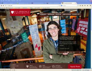
One of my favorites is my alma mater’s website, St. Lawrence University. Typical of the new design, there’s a wonderful, high resolution photo on the homepage. It’s inviting, slick, and very high end (just like the university, right?).
The folks at Nielsen took a look at a similar website, Bucknell University. It seems there has been quite a controversy surrounding Bucknell’s redesign. Appearances can be deceiving because the Bucknell site changed its navigation to provide a completely unconventional user experience.
The gorgeous photo of life at the university is impressive on both the St. Lawrence site and Bucknell’s. They both look great, but their navigation is quite different.
So, let’s get into that user experience on the new Bucknell website…
First, the impression Nielsen’s testers (prospective students and parents) got about the university was very positive. Bucknell provided “concise, eye-catching, and informative content” that users liked and it gave them an upbeat impression of the university.
But, how easy was it for users to find the information they needed at the site? Not easy at all, it turns out.
The Pitfalls of Modern Website Design
Here’s a summary of why users found it difficult and frustrating to find the information they were looking for on Bucknell’s new website.
The first thing is that the navigation was minimalist and hidden. Most website visitors look either to the left side or top for navigation prompts to the interior info on the site. To Bucknell’s credit, it has two at the top where they should be: “Start Exploring” and “The Everything Directory.”
But that’s where the trouble starts.
Doesn’t “Exploring’ seem vague? As a user, I can’t predict what I’ll get when I click on Exploring. There is “audience based navigation” in the Exploring menu, but studies have shown that users don’t necessarily self identify and don’t understand under which category they’ll find the info they’re looking for.
And if the Everything Directory contains everything, why not just break it down right from the homepage. Why do I have one extra click when I’m looking for Tuition, Courses, Admissions etc? Plus, the category breakdowns are alphabetical, but, again, most users aren’t familiar with the academic terms listed to find what they’re looking for.
Here’s what one parent said about the site, “I’m a college grad, and I had a hard time with this site. It would be so much easier if things would be where you think they would be. You have to hunt for everything.”
Participants couldn’t find a list of majors or the cost of tuition. And they didn’t realize that the university offered their program of choice.
You’ll find the reasons for the unfriendly user navigation in the Nielsen post. I hope every business thinking of a redesign takes a look.
Some of the problems…
Forcing people to use just two vaguely titled categories at the top; alphabetical listings when users (parents) aren’t familiar with academic terms, hidden, hard to find navigation; reliance on search as primary navigation.
Another major problem is the glossy visual design. It made the site pop, but it hurt usability. That’s because the large photo precluded helpful content above the fold. However, looking at the St. Lawrence site, I see that this didn’t need to be a problem.
Look at the St. Lawrence University site and you’ll see the same kind of attractive photo, but the top navigation menu offers users help to find the info they’re looking for. You’ll see Academics, Admissions, Athletics, News & Events, and Student Life conveniently located across the top of the homepage.
And then at the bottom, but above the fold, you’ll find About, News, and Spotlight. Over in the lower left is Students, Faculty & Staff, Alumni (that’s for me), and Parents (thank God that’s no longer for me!).
There’s even an Apply Now button at the lower right for eager students ready to get their app in right away.
The upshot of all of this is that if you are planning on a new website, it’s fine to go for a design that sets you apart from the crowd. That modern look and feel is visually appealing, including Bucknell’s.
But throughout the design process, think about usability. Test your ideas with people who would be using your site. Ask them what they think of the navigation and make changes when they get confused.
Remember, you don’t have much time to please your website visitors. And making their journey thru your site more complicated than it needs to be is leaving money…often lots of money (today's college tuition)…on the table.
Until next time,
Nick
Another helpful post on usability on the homepage.
Is Your Content Placement Steering Wheel on the Wrong Side?
Nick Burns is a Web writer specializing in persuasive copywriting and content marketing. Nick’s services include SEO Web writing, website information architecture, content marketing, consulting, and publishing. He provides clients a winning online strategy plus the content writing to make it work. You can contact Nick here.