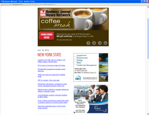
Banner ads from the CNY Business Journal News Network that I receive every day.
If you’ve invested in a banner ad and you’re not happy with the results, then here’s an idea that may work for you.
First off, what is a banner ad?
It’s an ad purchased and placed on someone else's website with a link to the advertiser’s website. Sounds good, especially if the site on which you’ve placed the ad reaches your prospects and customers.
The problem is that many web banners are generic brand/company awareness ads that don’t generate any interest from the webpage’s reader. Then, even worse, the ad links to the advertiser’s homepage, offering no special reason for the prospect to have clicked to get there.
How To Get More from Your Banner Ad and Landing Page
Target your ad to a specific audience with an enticing offer. Then, link the banner ad to a landing page written just for those who click onto it. (A landing page is a web page created specifically to be “landed” on from a banner ad or PPC link.)
Here’s how to create an effective banner ad and landing page:
- One Compelling Offer
Replace your generic awareness ad with an enticing offer: Special pricing on one of your products, free download of a relevant white paper, registration for a special event etc. - Maintain a Tight Focus on Your Landing Page
Effective landing pages are pared down. There’s nothing there not relevant to the ad. Every word of text and graphic element is focused on achieving a single result, the acceptance of the compelling offer. - Headline Directly Connected To the Offer in the Banner Ad
If your banner ad says, “Get Audit to Find Out Where Your Website Can Improve…50% Off!” then the headline on your landing page should say something like, “Get Audit to Find Out EXACTLY Where Your Website Can Improve to Drive Traffic, Engage Visitors, and Convert Leads to Sales & Get 50% Off”
Here’s the thing, the closer your banner ad message is to your landing page message, the better the results. - Design Landing Page with One Column
You want your visitor, who has clicked from the banner ad, to remain focused on the banner ad offer. You don’t want a right or left column like you have on the regular sections of your website. Your visitors aren’t checking you out, they’re checking out the banner ad offer. - Use a Relevant Image
People like to see a representation of what they’re buying. That’s why you see pictures of what looks like a 200 page book for an ebook download. Or a headshot of a main speaker at an event. Note: tests have shown that placing the image on the top left with the headline wrapped around it to the right performs better. - Strategically place Your Call to Action Buttons
There’s no problem placing your Call to Action buttons at the end of the page. But, if it’s a long page, place the calls to action at various places further up in the text. After all, if your visitor is already convinced she wants to buy, why make her read all of the text to get to the bottom?
If you try this out with more dynamic banner ads and strategic landing pages, let me know how you do. Do you get more clicks? Are they from better qualified buyers? You can place your comments in the section below. I’d be interested to know your experiences with banner ads.
Until next time,
Nick
Nick Burns provides clients a winning online strategy PLUS the content writing to make it work. His services include SEO Web writing, website information architecture, content marketing, consulting, and publishing. You can contact Nick here.