 If your website is not mobile friendly, you may be in for a big hit in your Google rankings. So many people search on their phones that Google is taking action to reward websites with excellent user experience on mobile devices.
Google wants to be sure that users, “get the most relevant and timely results, no matter if the information lives on mobile friendly web pages or apps. As more people use mobile devices to access the internet, our algorithms have to adapt to these usage patterns.”
And starting April 21, 2015, that algorithm change could drastically hurt your rankings.
The keyword here is Responsive Web Design: creating web pages that are easily viewed across a wide range of devices. Flexible grids and layouts that change with the device used and maintain an easy user experience. Your website should automatically scale to any size, with touch elements far enough apart and font size easily readable.
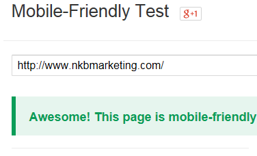
Is your website built with a responsive design so it's mobile friendly? You can easily check it out here.
And you can see with my site what happens to your web pages with responsive design. Check out my homepage on your desk top or laptop, then get out your phone and do the same. See how the content, text boxes, and navigation links organize themselves down the screen on your phone?
That’s responsive design. And now Google is going to include it when it ranks your site. If it’s not responsive, you may get seriously hurt in the rankings.
This is an issue for you and your webmaster to iron out. If you have a good content management system such as WordPress, you might be able to easily download a new responsive theme. Or install various plugins to help you create a mobile friendly site.
You may also consider this the nudge you needed to look into a fresh, new design for your website. If you do, call me first. That way we can talk about writing the messages that effectively drive your sales, then have the new responsive design support and enhance those messages. (Rather than the other way around where we're squeezing the all-important content into a prebuilt design...not a good idea.)
A content first approach assures you of a keyword rich, engaging website that gets found in the search engines and makes sales. And responsive design assures you that no matter where your prospects and customers are or what device they’re using, they’ll easily find you. Plus, Google will share the love, too!
Until next time,
Nick
Nick Burns is an SEO web writer specializing in persuasive copywriting and content marketing. He provides clients a winning content strategy plus the special web writing to make it work. You can contact Nick here.