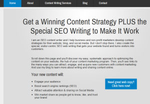
Above the Fold at NKB
Is concern with your website content “above the fold” outdated? Some think so because your pages show differently depending on the mobile device your visitor uses. Who’s to say what is above the fold? More to the point, what fold?
But according to the Web usability experts at Nielsen Norman Group, attention to your content above the fold is still crucial to web pages that work. The content you put at the top, on the first screen that your visitor sees, is the most read content on the page. On average, 84% more! Here’s the post with the details…
Above the fold is the place that your website visitors decide whether they should scroll down looking for more or click away to another, more helpful site. It also eliminates a second step for visitors who would have to scroll down to find out if they like your site. You might think that because scrolling down is so easy these days that this wouldn’t matter.
But get into the head of your visitor…or yourself when you search the Web for answers. You are generally intolerant of a website that doesn’t interest you right off the bat. Why? Because it’s so easy to go elsewhere online.
“Above the fold” is an old fashioned phrase. It’s a newspaper printing term that signifies the area at the top, or above the fold of the finished newspaper. It’s the part that generally gets read first. That's why it is here that editors place the most important news events of the day.
So, if it’s important to catch the interest of your website visitors right away, then let’s call this important, interesting content placement, “at the top.” Tell your visitor what you do, what info they’ll find, and why you’re the best “at the top” of each page.
84% difference cannot be ignored. Even if you have a gorgeous image at the top, place your headlines and lead text above it or inside it. Create that connection quickly and you’ll keep visitors clicking through your site, not away from it.
Until next time,
Nick
More info on the content “at the top”:
Tell Your Website Visitors What's in the Can
Connect Fast with Your Website Headline and Intro Text
Replace that Slider with a Homepage Headline that Works
A Homepage Slider is a Bad Idea
Get Great Headlines! Six Ideas that Really Work
Nick Burns is an SEO web writer specializing in persuasive copywriting and content marketing. He provides clients a winning content strategy plus the special web writing to make it work. You can contact Nick here.
