August 23 is Internaut Day, the day the World Wide Web went public. And this year, 2016, is the 25th anniversary of world changing public access to the internet. Tim Berners-Lee started the whole thing while working at CERN, the European Particle Physics Laboratory and he remains the director of the World Wide Web Consortium (W3C).
According to Internet Live Stats, as of 1:16 PM as I write this on August 23, 2016, there are 1,070,338,658 websites online right now! So I wondered, what did the Homepage on the first of over 1 billion websites look like? How does it measure up to today’s standards for an easy to navigate, user friendly, visitor-centric website?
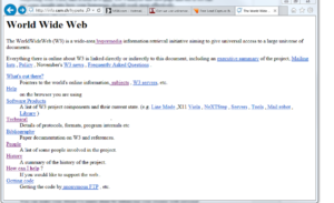
Surprising well! First, take a look at it here. Let’s analyze this first page and see if we can get some insight into how your homepage should work most effectively.
“World Wide Web”
Notice the name in the upper left corner, World Wide Web. That’s where it should be because most of your customers probably read left to right. Our eyes start to the left to figure out whether or not we’re in the right place, and here we see what this website is all about. Your company name, logo, and tag line also belongs on the upper left side.
“The WorldWideWeb (W3) is a wide-area hypermedia information retrieval initiative aiming to give universal access to a large universe of documents.”
This first sentence is the headline and it tells us exactly what W3 is and what it does. Your headline should do the same. Your visitor wants to feel comfortable that he/she can get what they need from your site so tell them right off what you can do.
“Everything there is online about W3 is linked directly or indirectly to this document…”
We can tell by the next line from this very first website that Berners-Lee understood the homepage was a portal. It elegantly, simply lets us know that everything we want to know about W3 can be found from this page. It’s where visitors can see how they should navigate to the rest of the site.
They won’t click away in frustration, lost in company jargon. And no one should get lost on your homepage either. Make sure there are links to whatever your company offers that are easy to find in a quick look down the page. Scan the list on our first site and see how easy it is to find Software, Protocals, References etc.
“People: A list of some of the people involved in the project.”
“History: A summary of the history of the project”
The first About Us pages!! Look at the Bios, they’re informative, conversational and personal. Even self-deprecating…under “’Erwise’ team” it says, “…is ‘a’ with two dots above it…we must get some character set description into HTML!”.
You can make your About Us pages shine by enhancing your resume with personal stories and philosophies of life that have helped you in business. Also tell your visitors what you like to do outside of business, your hobbies, family, and interests.
“How can I help? If you would like to support the web.”
There’s even a Call to Action. In this case, it’s not to buy but to contribute by putting up data, managing a subject area, or writing software. I’ve been saying this in so many of my blog posts: The Web is not a static medium where you pump out your message to a passive audience, it’s action oriented.
The point of your website is to get your visitors to do something. You want them to call, subscribe, donate, or buy. That’s why direct response copywriting works so well online. Amazingly, the first website contains a link from the homepage asking you to support the Web. Suggesting ways for you to act and make the Web grow. Fantastic!
So take a look at this simple, highly effective first website. Appreciate its genius. Marvel at its prescience in figuring out the best way to present your business online.
And Happy Internaut Day!
Until next time,
Nick
Posts you might also be interested in:
Is Your content Placement "Steering Wheel" on the Wrong Side?
A Homepage Slider is a Bad Idea
7 Critical Elements of a Visitor-Centric Homepage
About Us Page...Gain Confidence by Getting Personal
Nick Burns is an SEO web writer specializing in persuasive copywriting and content marketing. He provides clients a winning content strategy plus the special web writing to make it work. You can contact Nick here.

