image courtesy of artur84/freedigitalphotos.net
If your website copy can get into the minds of your online visitors the right way, you’ll make sales. StubHub is a ticket website whose copy did just that for me. I used it to buy tickets to a hockey game with my son, who lives in Boston. We’re seeing a Bruins v Islanders game later this month.
My son recommended StubHub after I searched the Bruins site for tickets and found them too expensive…like around $120 for seats a few feet from the roof! At StubHub I got two tickets for $58 each. Nice deal.
The thing is, people worry about buying tickets from “scalpers.” Especially online when you can’t see the “sales people” face-to-face. My wife warned me about it, said she’d heard of rip offs online and that I should be careful. I hesitated about buying tickets from an online vendor, but I checked out StubHub anyway.
Internet marketers call the places on a website that cause visitors to hesitate “friction.” But StubHub’s Web copy broke through my anxiety and reduced friction every step of the way.
Let’s take a look at how they did it so you can do the same on your website…
StubHub Reduces Anxiety and Increases Confidence
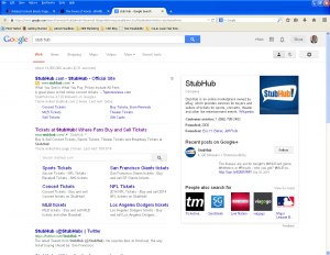
 First off, search “stub hub” in Google and on the results page you’ll see friction-easing language right off the bat. Take a look at the Google+ box in the upper right corner, “StubHub is an online marketplace owned by eBay…” Owned by eBay, I like that because eBay is a solid company.
Also on the search engine results page (SERP):
• Title Tag in organic search: Tickets at StubHub!: Where Fans Buy and Sell Tickets.
I’m a fan! Great place to describe your audience.
• Meta description: Buy and Sell Concert Tickets, Sports Tickets, Theater Tickets, Broadway Tickets at StubHub!
Notice Concert Tickets and Theater Tickets first and third in the list. In my mind, it’s sports that’s probably corrupt, but who’s going to rob Concert or Theater aficionados? To me, this copy adds to the site’s credibility.
(I may be naïve on this. There may be a phony ticket problem with theater tickets, too, but for me, the words “concert” and “theater” settle my mind.)
 Now let’s click onto the site.
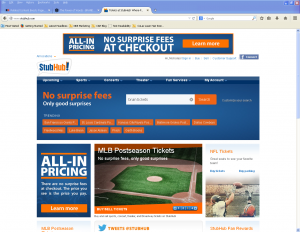
• StubHub!
Love the exclamation point in the logo because, yes, I’m excited about buying tickets to the game! StubHub is getting into my head.
• No surprise fees: only good surprises
First thing I read on the homepage is that they are not going to hide anything from me. When it comes to commodities like tickets, people are afraid of not getting the pricing they think they’re getting. You must reassure them quickly.
• Trending
The action on the site is current. That means people are buying tickets today for events I’m familiar with. People get confidence following the crowd. You can do the same if, for example, you can get figures on your pages with current sales numbers.
• ALL-IN-PRICING: There are no surprise fees at checkout. The price you see is the price you pay.
Repeating that there are no hidden fees. This must be a big problem with online ticket sales. I'm reassured here.
• Easy, thorough Search
Type in “bruins games” (no quotes) and you’ll get a detailed schedule of upcoming games. It’s as if an actual person is speaking with me about the game I want tickets to, affirming the schedule.
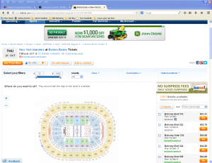
• Click on the game
Pop-up warning to print tickets out before the game. I’m getting confident that as a new visitor, StubHub will hold my hand to get this right.
• Go with friends link and Where do you want to sit? Play around with the map to see what is available
 That’s just what I did. See under Search where I mentioned that the copy makes it seem there’s an actual person helping me? What about these lines of text. They're exactly as a conversation with a real person would go…it’s brilliant copywriting.
• The Go button
You’re one click away from purchase so here you’ll get all the last minute info you need to feel confident about buying. StubHub describes how their tickets are made available, their guarantee, and that they aren’t responsible for venue or scheduling changes.
This is really good copy with a lot of thought put into what I’m thinking as I work my way through the site to make a purchase. It answers my objections or any uneasiness every step of the way.
What are the things that make your website visitors hesitate to buy, call, or donate? Think about the whole process from one page to the next. You can even do this by asking what a real person sitting in front of you is thinking as they go through your website.
Then write your copy as if you’re right there carrying on a conversation, answering objections and making your customer feel good about clicking BUY.
Until next time,
Nick
Nick Burns is a Web writer specializing in persuasive copywriting and content marketing. Nick’s services include SEO Web writing, website information architecture, content marketing, consulting, and publishing. He provides clients a winning online strategy plus the content writing to make it work. You can contact Nick here.
